How do you not overwhelm the user with a wall of content?
When thinking about user experience, this question often comes to mind as we develop websites. The main goal for the UX/UI team is to guide visitors through the business in a way that shows exactly what you want them to see and to understand, all while delivering a better experience.
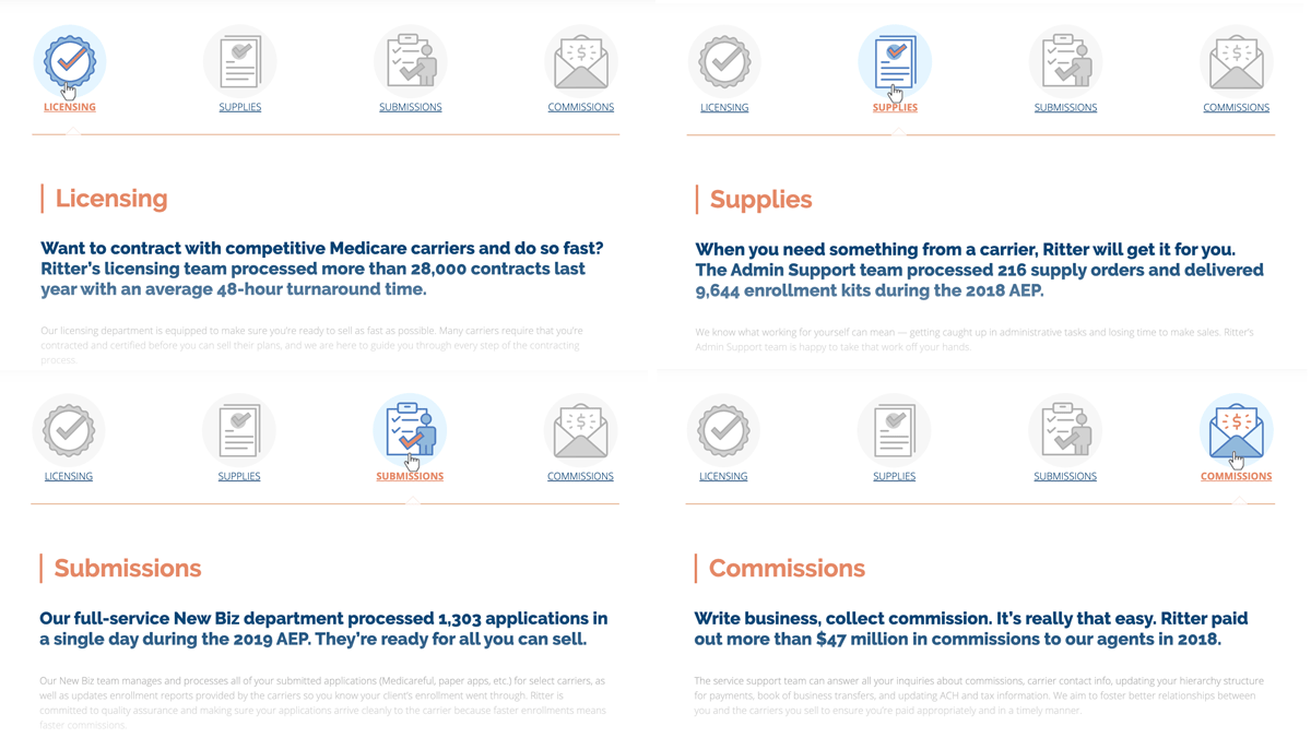
Recently, our marketing department sent us four pages of content to incorporate into the company website’s Support page. The content was split into four areas. However, those subjects had the same purpose – to promote the Support department on the website. I asked myself, “why not combine them and make the whole page aesthetically pleasing?”
Our team decided to create one page with four custom icons, like tabs. It turned out really well! The page is now more interesting, more interactive, and much more appealing to the user.
Here is what we’ve got:

It’s worth mentioning the SEO terms since those fields are hidden now. No worries. You may already know that Google rolled out the Mobile First indexing initiative in March of 2018. As far as SEO ranking, the hidden content is treated equally. It’s safe to use tabbed content, sliding menus, accordions, and other similar methods to make content less overwhelming.

