
Role: Lead UX/UI Designer
Team: IRS Online Services + cross-functional dev team
Goal: Replace a paper-based CAF request process with a fully digital, user-friendly workflow for business tax professionals
Date: 2024 - present
Overview
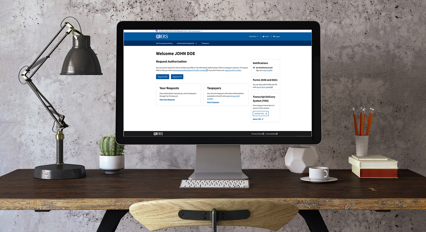
As the Lead UX/UI Designer for IRS’s Tax Pro Account platform, I led the design of a fully digital experience for submitting Centralized Authorization File (CAF) requests—a traditionally paper-based process used by business tax professionals to gain client authorization.
This was a high-impact initiative that involved modernizing a legacy process, reducing submission errors, and creating a unified user experience across multiple IRS systems—all while navigating complex IRS policies, backend validation rules, and accessibility requirements.
“As an enrolled agent, I need to request a CAF number quickly so I can file returns on time”
The Problem
Before this initiative, business tax professionals faced:
- Weeks-long delays due to a manual, paper-based CAF submission process
- Lack of clear guidance on eligibility and validation rules (especially for firms with multiple office locations)
- Confusing workflows spread across disparate IRS systems with inconsistent UX patterns
The process was especially painful for firms needing to manage multiple CAFs tied to different Employer Identification Numbers (EINs) and physical office addresses.
Discovery & Research
I partnered with product owners, business analysts, policy experts, and developers to deeply understand the end-to-end experience.
Key insights included:
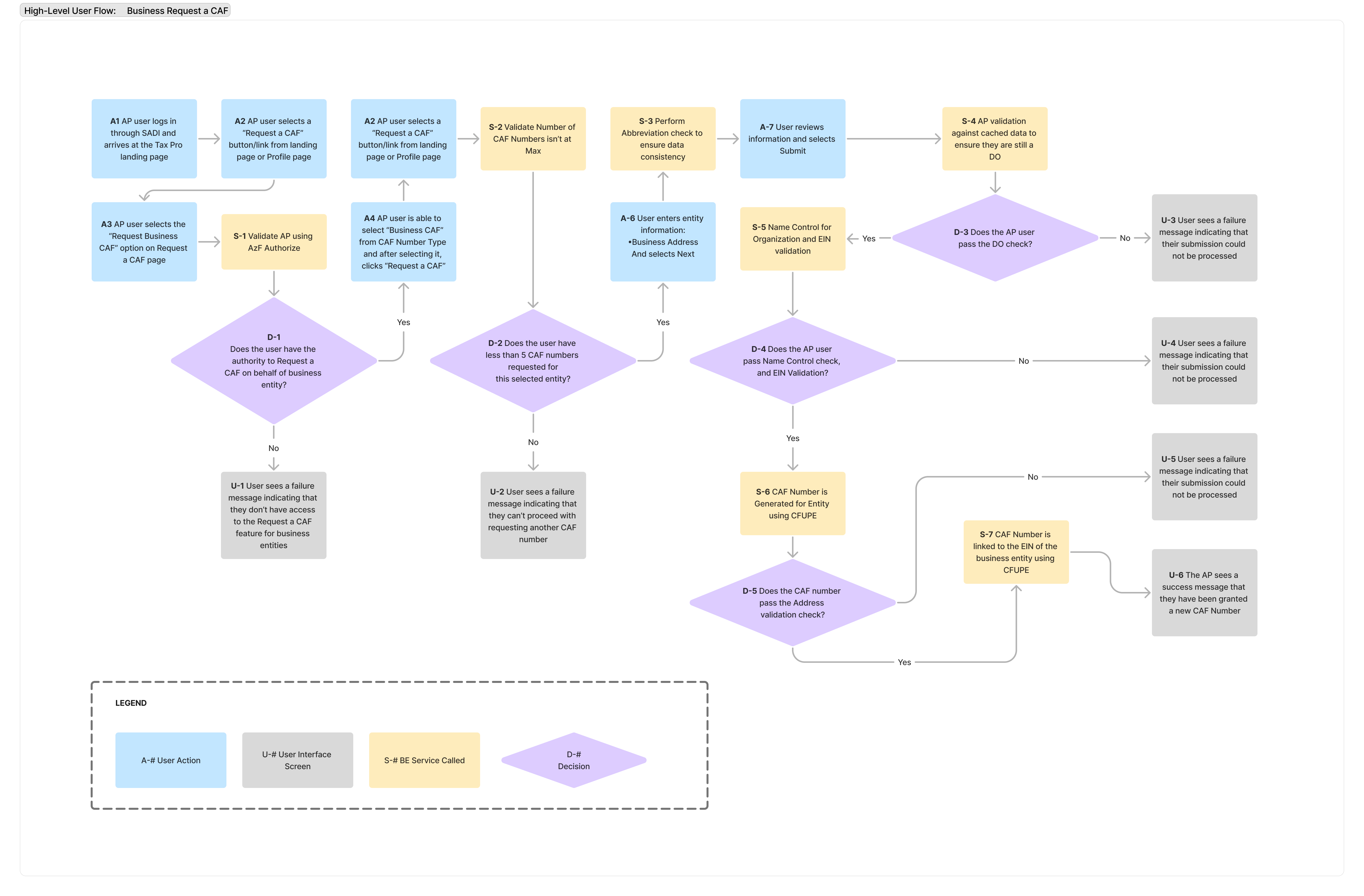
- Business tax professionals were frequently submitting invalid or incomplete requests due to hidden or complex rules (e.g., role mismatches, address mismatches, EIN conflicts)
- Users lacked confirmation or error feedback after submission—leading to unnecessary calls to IRS support lines
- Professionals managing multiple offices needed greater control and flexibility over how authorizations were tied to location-specific CAF numbers
UX Design Strategy
Dynamic, Role-Aware Form
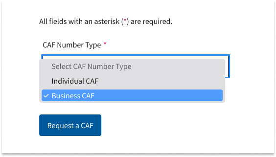
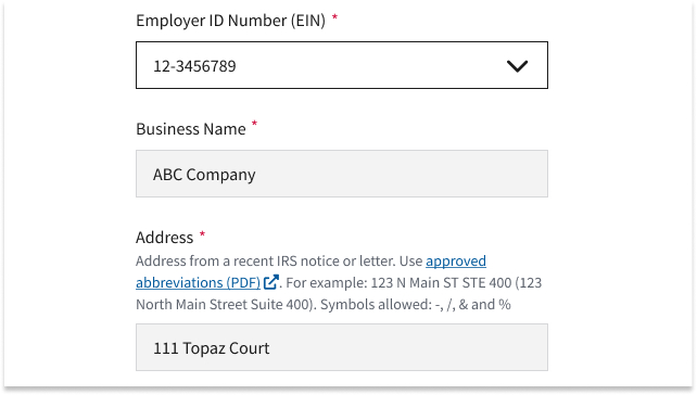
I designed a smart, modular form that adjusted dynamically based on user role (individual vs. business), allowing authenticated users to:
- See prepopulated data like legal business names and associated EINs
- Use location-aware logic to select or override addresses for multi-office organizations
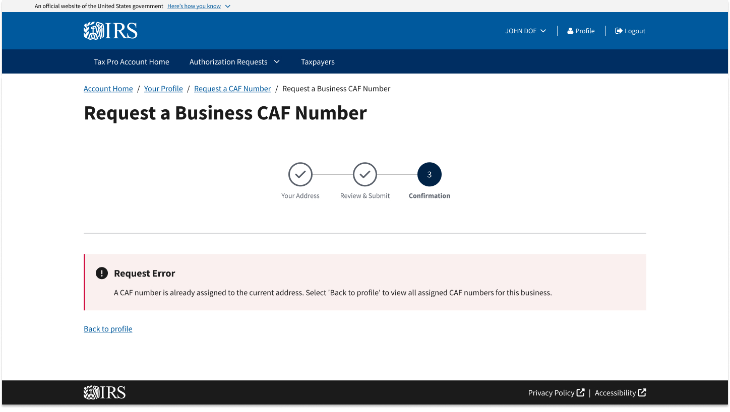
- Receive real-time validation and clear, human-readable error messages when issues like role mismatches or CAF capacity limits occurred
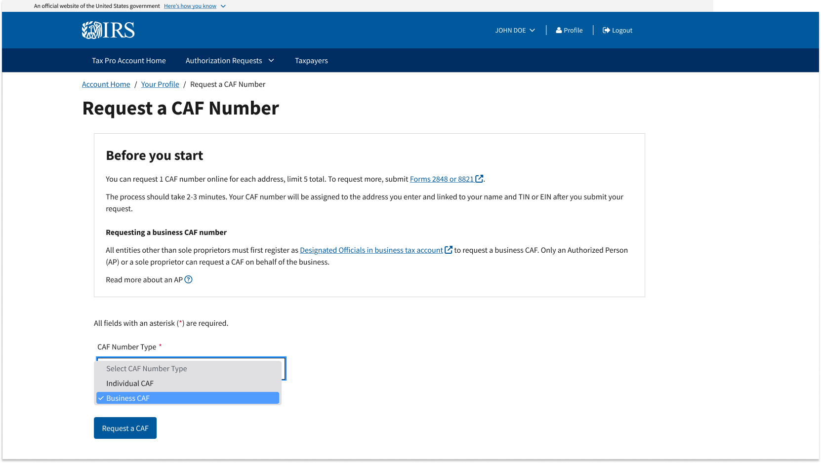
Step-by-Step Guidance
To improve clarity and reduce mistakes, I added:
- A guided eligibility section with collapsible details for different user types
- Visual patterns like info banners, status chips, and inline tooltips to call out key information and reduce context-switching
- Integration of IRS policy guidance into the UI in a plain-language, accessible format
Design Consistency Across IRS Platforms
To reduce learning curves and cognitive load, I implemented shared design patterns across the Tax Pro Account, BTA, and IOLA applications by:
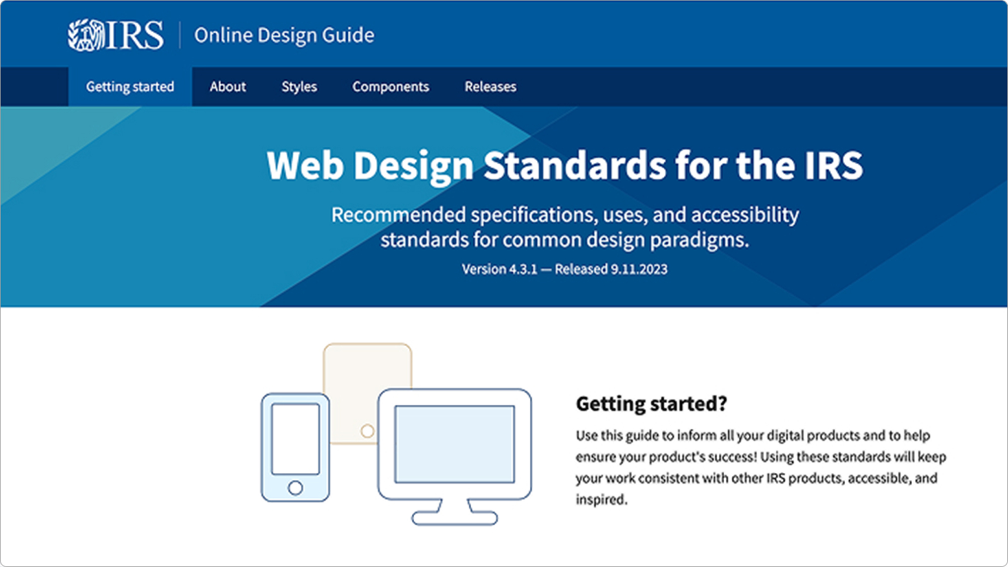
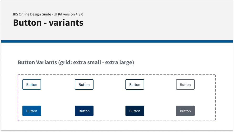
- Using the ODG (Online Design Guide) component library
- Collaborating with the design system team to update or request new patterns when necessary
- Maintaining visual and behavioral consistency to create a familiar experience across IRS services
Accessibility-First Approach
Accessibility wasn’t an afterthought. I conducted audits and iterative testing in collaboration with 508 specialists to ensure:
- All components met WCAG 2.1 AA standards
- Forms were fully navigable by keyboard
- Labels, ARIA roles, and screen reader support were tested with multiple tools
Key Challenges & How I Solved Them
| Challenge | My Solution |
|---|---|
| Opaque backend validation rules (e.g., EIN mismatches, invalid roles) | Designed real-time error handling and contextual feedback within the form |
| Multiple offices per firm (address flexibility) | Introduced location-selection logic with manual override options |
| Inconsistent UX across IRS systems | Established cross-app patterns using the ODG component library |
| Legacy systems integration | Collaborated early with dev leads to ensure design feasibility and backend alignment |
Results & Outcomes
- Replaced a multi-week paper process with a digital workflow—cutting turnaround time significantly
- Reduced submission errors by surfacing validation issues proactively and clearly
- Created reusable UX patterns now used in future IRS digitization efforts
- Improved overall trust and satisfaction from tax professionals engaging with the Tax Pro Account platform
Metrics & Success Criteria
| KPI | Baseline (Paper-Based) | After Launch (Digital) | Improvement |
|---|---|---|---|
| Time to Completion | 10–30 days | 2 min 30 sec | From days to minutes |
| Form Error Rate | 18 % (hand-filled mistakes) | 7 % | ↓ 61 % |
| User Satisfaction (1–5 scale) | 2.3 | 4.6 | ↑ 100 % |
Reflections & Future Enhancements
This project deepened my experience designing at the intersection of policy and usability. I found it rewarding to translate complex federal validation rules into clear, supportive, and accessible UI.
If revisiting this project, I’d recommend:
- Conducting external usability testing with third-party tax professionals earlier in the process
- Exploring AI-powered guidance or smart FAQs to help users self-resolve issues based on IRS rule sets
- Integrating LLM-based assistants trained on IRS.gov content to further reduce user confusion and support center load
Conclusion
This project is a strong example of how thoughtful UX strategy, accessibility, and close cross-functional collaboration can transform bureaucratic pain points into user-friendly digital services. I’m proud to have led a design effort that modernized an outdated IRS process and made the work of tax professionals faster, easier, and more transparent.