
Role: Design Lead. Identified organizational challenges, designed a new structure, implemented it within our team, and ensured adherence.
Team: IRS Online Services – User Experience Services - Tax Pro Account
Timeline: June 2022 - Present
Problem
When I began as a Design Lead on the IRS Tax Pro Account project, our team’s Figma files were extremely disorganized. Locating specific screens was challenging due to visual similarity and minor differences. This made referencing previous designs, implementing feedback, or linking screens to developer user stories cumbersome and inefficient.
Objective
Develop a clear, intuitive, and scalable organizational system to enhance efficiency, collaboration, and ease onboarding for new team members.
My Solution
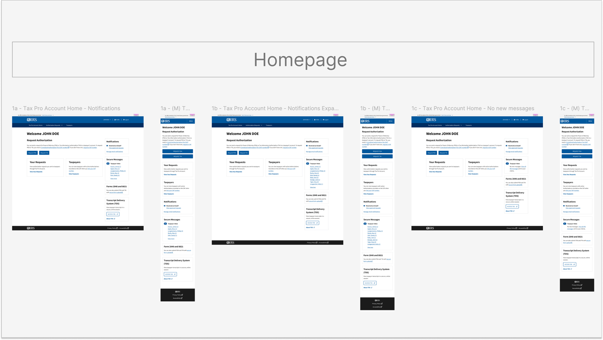
Step 1: Standardized Screen Naming
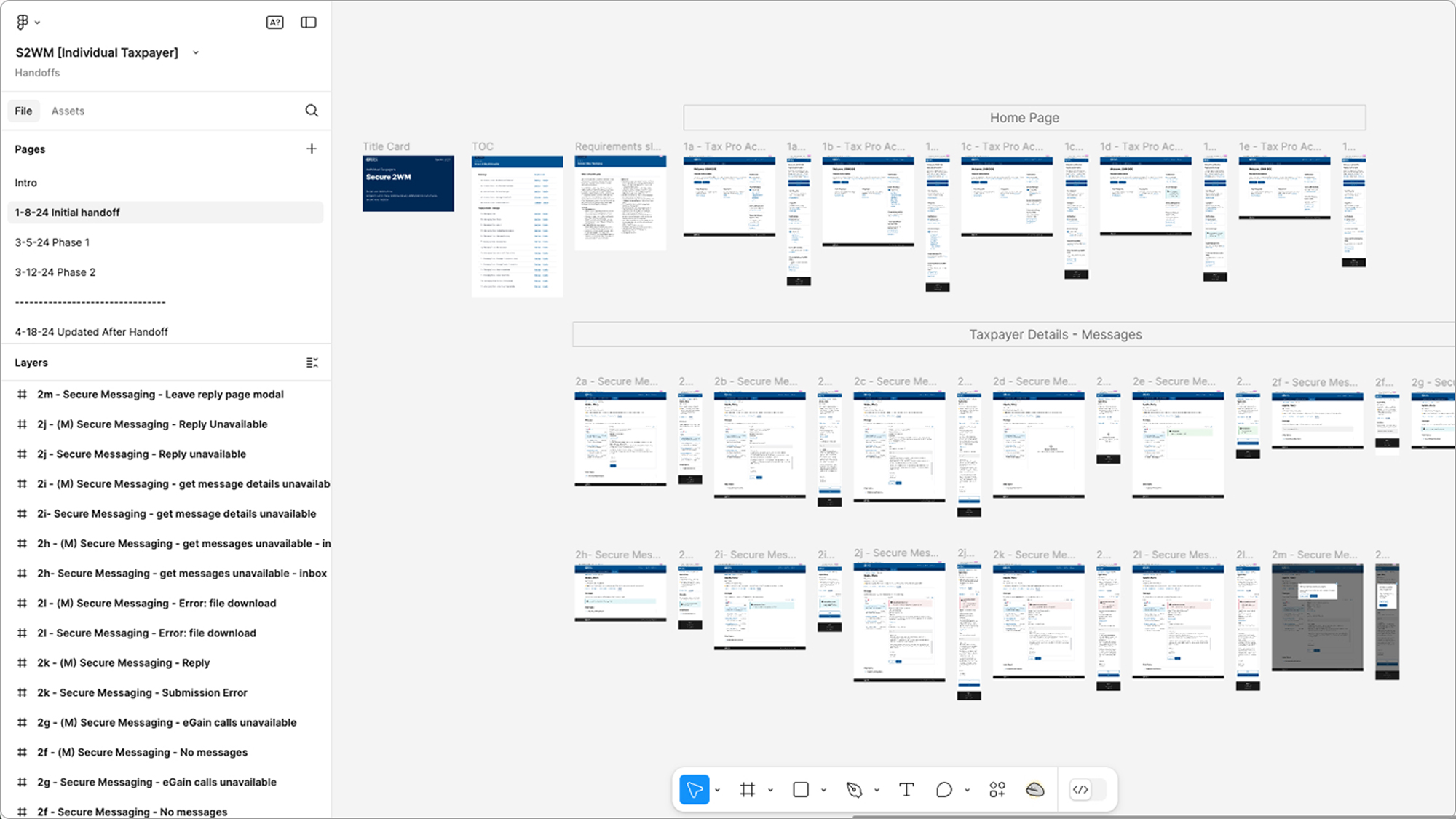
Introduced an intuitive alphanumeric naming system (1a, 1b, 1c, 2a, 2b, 2c, 3a, etc.). Each screen had a unique identifier, making referencing and finding screens easy and efficient.
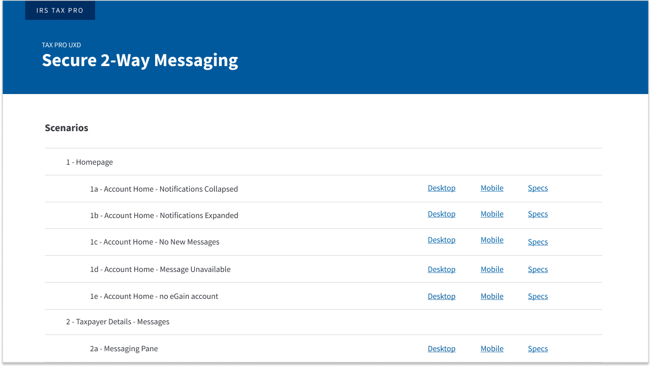
Step 2: Interactive Table of Contents
Created a dedicated Table of Contents (TOC) page within each Figma file. The TOC included:
- Clear listings of all screens organized by feature and state.
- Hyperlinks directly to desktop and mobile versions of each screen.
Step 3: Enhanced Visual Organization Visually grouped screens logically within Figma, clearly labeling each group. This drastically reduced visual clutter, enabling quicker identification of screens.
Impact
- Efficiency Gains: Reduced the time needed to locate screens by approximately 75%.
- Improved Collaboration: Allowed team members and stakeholders to reference screens precisely and confidently using the standardized naming system.
- Developer Handoff: Streamlined the process of linking screens to acceptance criteria, especially valuable when linking screens long after their initial creation (up to one year later).
- Ease of Onboarding: Dramatically simplified onboarding new designers, allowing them to quickly understand project structures and workflows.
Lessons Learned
- Investing time upfront in file organization saves significantly more time later.
- Clear documentation and intuitive naming systems improve communication across product, business, and development teams.
Future Enhancements
- Continued refinement based on evolving project needs.
- Regular team training sessions to maintain adherence to the organizational system.
Note: Due to the sensitive nature of this federal government project, detailed prototypes, internal documentation, and research artifacts cannot be shared publicly.